Palver
Understand and Engage with Social Trends
Palver is a data transformation platform that aggregates information from diverse sources—social media, news outlets, radio, TV, and more—converting it into actionable insights. Although the platform's capabilities were extensive, years of adding new features without a cohesive design strategy left its dashboard difficult to navigate and unintuitive. This limited users’ ability to leverage the platform's full potential.
I was brought in to redesign the dashboard, improving usability while also expanding the product’s functionality, ensuring a seamless experience for Palver’s users.
Year
2024
Scope of Work
User Interface
User Experience
SaaS Dashboard
Duration
9 Weeks
Let's get started
The original platform was inefficient and frustrating for users. It separated source information and insights, making comparisons difficult. Users couldn’t easily cross-reference search results across platforms like Twitter, WhatsApp, and TikTok. Key features were buried in an unclear and oversimplified menu, and re-entering data to revisit queries or share results added to the inefficiency. Overall, the design hindered usability and collaboration.

Problem
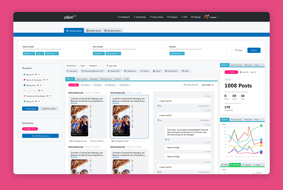
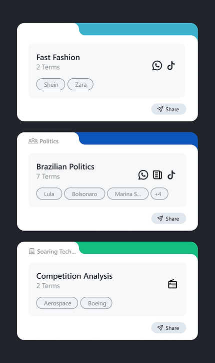
Source information (e.g., WhatsApp messages) and insights were separated, complicating comparisons.
Solution
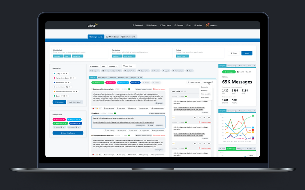
All data now appears on the main dashboard, with toggleable message and insights tabs for easy viewing.
Users couldn’t compare the same search results across sources like Twitter, WhatsApp, and TikTok.
Source-specific tabs on graphs and maps now allow quick cross-platform comparisons and term comparisons within a source.
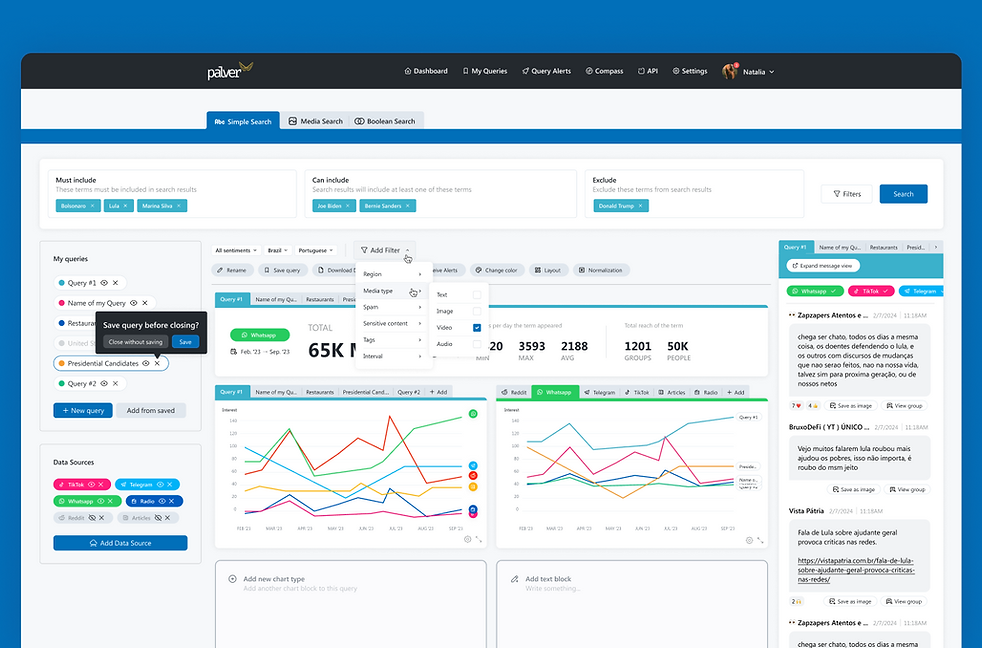
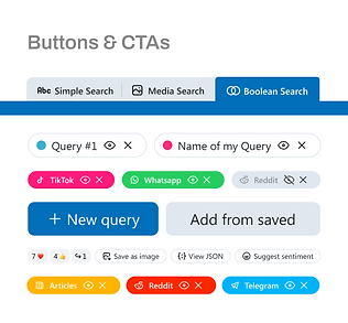
Key features were hard to locate due to an oversimplified menu with unclear icons.
We redesigned the menu, placing features where users naturally look for them.
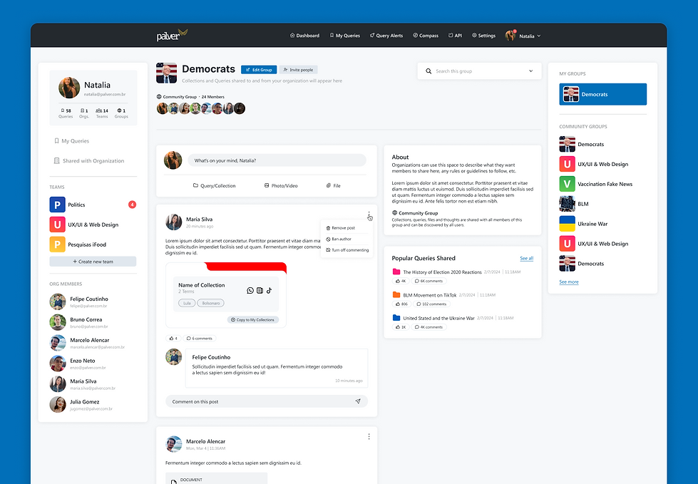
Re-entering info was needed to revisit queries, and sharing results was difficult.
We added PDF downloads, a community for shared topics, and company groups for collaborative discussions.
Wireframes and User Flows
I started creating simple wireframes to get initial feedback from the Palver team.
There was a lot of back and forth to get to the point of approval and I'm really happy with how things turned out.

Design with Purpose
The UI had a lot of moving parts that needed to be addressed to everything feel cohesive and with purpose.
The designs created based on the approved wireframes were done with a lot of care and attention while focusing on solving the problem and being nice to look at.
The screens you see below are only 10% of all the work that was done on this project. At the end of it, there were 60+ screens created to fill every flow and situation.


Logos, Fonts & Colors
Palver had an established font for the platform, but we enhanced the original color palette by adding colors specific to each source in the search results. This color-coding made the dashboard more intuitive, helping users quickly differentiate information by source.

Transforming Complexity into Clarity
This project was complex, requiring thoughtful solutions to improve usability, organization, and visual clarity. I’m thrilled with the final design, which made the platform more intuitive and engaging. The Palver team and their users responded with overwhelmingly positive feedback and higher engagement in the months after launch.